Design
The Art of Letters - Kris Sowersby
Expressing the intersection of art, function and form in type design
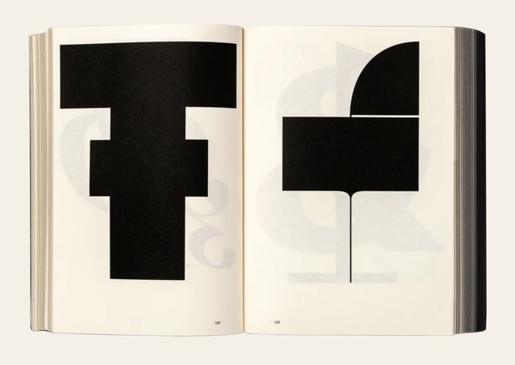
Kris Sowersby: The Art of Letters is a visual feast of letterforms celebrating one of the world’s leading type designers. The 800 page publication examines Sowersby’s letter drawing practice while considering the characters as independent works of art, exploring their interconnections of function and style. It champions the absurd beauty involved in creating multiple expressions of predetermined alphabets through nuance and theory.
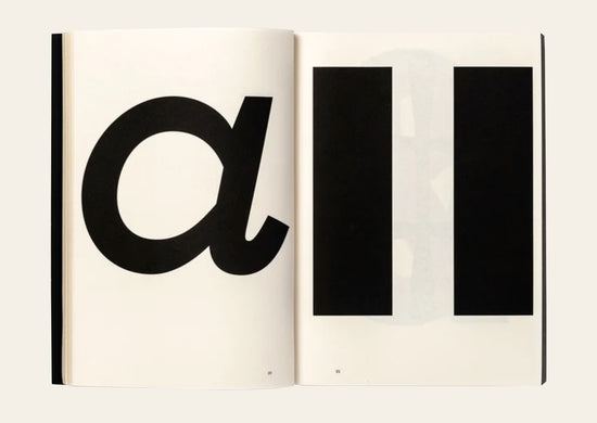
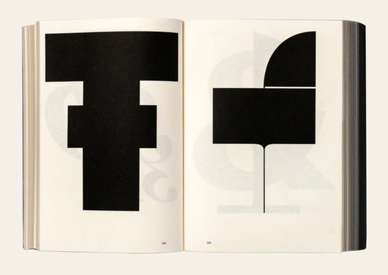
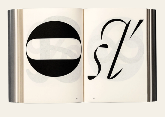
While a typeface is a well considered set of many elements, if one removes the context of language systems and alphabets, each character may be viewed as a singular abstract drawing, as art in their own right. As presented in this book, it allows us to re-see, or to see for the first time, their individual form and function.
As Sowersby expresses, “There is no definitive form of the alphabet. The alphabet is a concept made concrete through countless written and designed letterforms; the alphabet is not defined by a single typeface but expressed through all of them. There’s sets of rules, largely unwritten rules, of how a typeface is put together, about relationships between letterforms and between styles”.
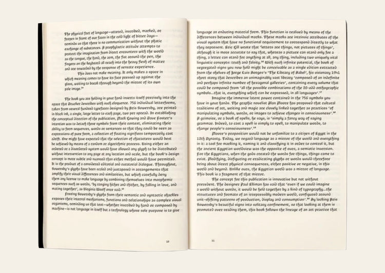
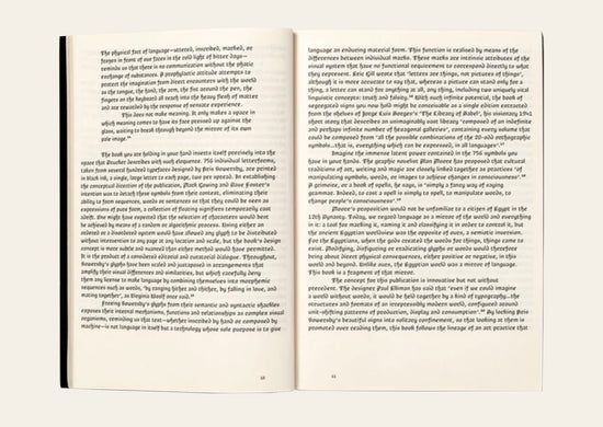
Printed one per page in black on cream paper, the publication features over 750 large character illustrations selected from Klim typefaces including Calibre, Domaine, Founders Grotesk, Heldane, National, Signifier, Söhne and Untitled. The volume features a fascinating essay titled ‘What we read when we see’ by graphic designer, writer and educator Paul McNeil and a foreword by Formist publisher and designer Mark Gowing.
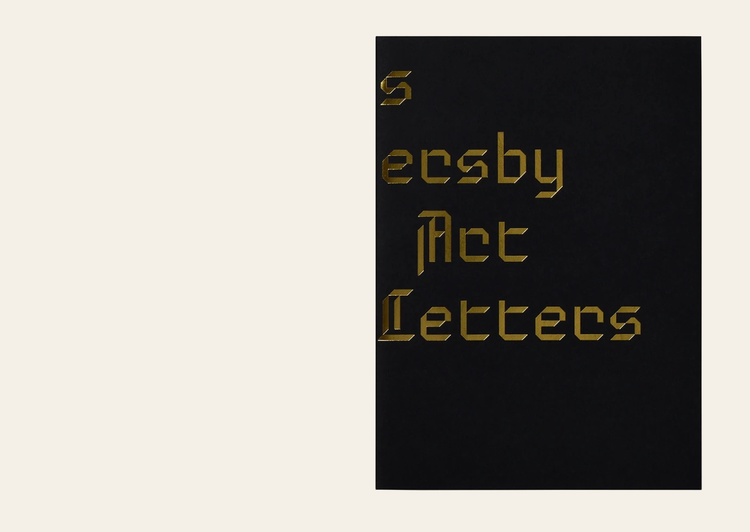
Kris Sowersby: The Art of Letters is finished with black-edged pages and the dust jacket features gold foil-stamped custom typography. Sowersby and Gowing collaborated on a custom typeface used to typeset the book. Inspired by the rich history of rotunda typefaces, its use is exclusive to the publication.
Kris Sowersby of Klim Type Foundry is one of the world’s most celebrated type designers. Along with his popular library of commercial fonts, Sowersby has also designed custom typefaces for commissioners including The Financial Times, PayPal and National Geographic. He has received numerous awards and accolades, including a Certificate of Excellence from the New York Type Directors Club and the John Britten Black Pin, the highest award given by the Designers Institute of New Zealand. In 2019, Sowersby was named an Art Laureate by The Arts Foundation for his continuing contribution to New Zealand Art and Design.
Design: Formist
Essay: Paul McNeil
Typeset in Brotunda
Formist, 2021
Softcover, 800 pages
Foiled cover with black page edges
150mm × 210 mm
- Regular price
- AUD 120.00
- Regular price
-
- Sale price
- AUD 120.00
- Unit price
- per
Couldn't load pickup availability

Item added to your cart